

Healthcare communication has never been more important than it is in 2026.
Across the UK, patients are more informed, more digitally connected, and more selective about where they seek care. At the same time, healthcare and medical brands are dealing with heavier pressure to communicate responsibly, clearly, and confidently. Whether you are a private clinic, healthcare provider, NHS-related organisation, pharmaceutical brand, medical device company, health-tech startup, or wellness brand, the way you communicate matters.
In healthcare, poor communication does not only lead to lost customers or missed marketing opportunities.
It leads to confusion, anxiety, mistrust, and in some cases, poor decisions.
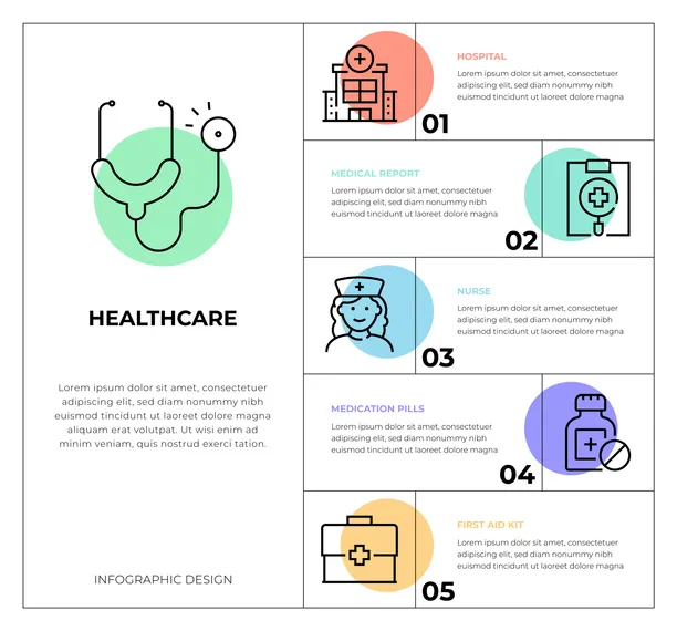
This is why infographics have become one of the most powerful tools for healthcare marketing and patient education in 2026.
A high-quality medical infographic can take a complex health topic and turn it into something clear, calm, and easy to understand. It can reduce patient confusion, support better decision-making, improve trust, and strengthen brand authority—while also performing extremely well online through SEO, social sharing, and engagement.
But healthcare infographics must be handled differently from infographics in other industries.
Healthcare audiences are sensitive. Regulations matter. Accuracy matters. Tone matters. Accessibility matters. The design must be clear but not alarming. Professional but not cold. Visual but not sensational.
This ultimate guide showcases infographic design for healthcare & medical brands, specifically how you can use them effectively for your UK brand in 2026. You will learn firsthand what healthcare infographic design actually involves, why it performs so well, which formats work best, how to ensure compliance and credibility, as well as how to use infographics across your website, social media, print materials, and patient workflows.
Why UK Healthcare Brands Need Better Visual Communication in 2026
In 2026, UK healthcare brands are communicating in a more challenging environment than ever before.
Patients have more choices, especially in private healthcare. They are researching conditions online, comparing providers, checking reviews, and looking for clarity before they book appointments.
Even NHS-linked services face rising communication demands. People want to understand wait times, referrals, procedures, and patient pathways. Many individuals are navigating health concerns while under stress, with limited time and emotional energy.
This creates a communication gap.
Medical information is often complex. It contains terminology, risk discussion, and step-by-step processes. Yet the patient reading it may be anxious, tired, or overwhelmed. When healthcare content is presented as long paragraphs, most people struggle to absorb it. They may skim, misunderstand, or stop reading entirely.
Infographics solve this by reducing effort.
They present information quickly and clearly. They guide the eye. They reduce confusion. They make health content feel more manageable.
In 2026, healthcare brands that communicate visually are not only more engaging. They are more trusted.
What Medical Infographic Design Actually Means
Medical infographic design is the process of turning healthcare information into visuals that are clear, accurate, and easy to understand.
It includes patient education infographics, clinical explainer graphics, data visualization for health outcomes, and marketing-focused visuals that communicate services or results.
Healthcare infographics may be used for:
- Explaining conditions and symptoms
- Patient preparation guides
- Post-treatment recovery instructions
- Medication safety reminders
- Screening and prevention awareness
- Waiting room and clinic posters
- Health campaign content for social media
- Community health education resources
- Clinical research summaries
- Healthcare reports and dashboards
Unlike general marketing infographics, medical infographics must focus heavily on clarity and responsibility.
They are not just about grabbing attention.
They are about guiding understanding.
Why Infographics Work So Well in Healthcare
Healthcare is one of the industries where infographics naturally perform extremely well, and there are specific reasons for this.
First, healthcare topics are often stressful. When someone is worried about symptoms or a diagnosis, they want information that feels calm. Infographics create calm by simplifying and structuring information.
Second, healthcare information is complex. It involves processes, timelines, and cause-and-effect relationships. Visual explanations help people understand what will happen and what they should do next.
Third, patients need reassurance. A healthcare infographic can show steps, outcomes, and safety guidance clearly, which builds confidence. When patients understand a process, they fear it less.
Fourth, healthcare trust is fragile. A brand that communicates clearly appears more credible. Clear design makes the organisation feel organised and professional.
Finally, healthcare content is highly shareable. People often share helpful health information with family and friends. Infographics are easier to share than long articles, which increases organic visibility.
In 2026, these advantages matter even more because patients are seeking clarity faster than ever before.
The Most Effective Healthcare Infographic Types in 2026
Different healthcare goals require different infographic formats. The best infographic design for healthcare & medical brands in 2026 choose formats based on the patient’s need. Here are a few quick examples:
Symptom and condition explainers
Condition explainer infographics perform very well because they help patients identify what something might be and what to do next. These visuals typically cover common symptoms, causes, risk factors, and when to seek medical support.
The best condition explainer infographics do not encourage self-diagnosis. They encourage informed awareness and responsible next steps.
Treatment and procedure timelines
Procedure timelines help patients understand what happens before, during, and after a medical procedure. These are extremely useful for surgical clinics, dental practices, aesthetic clinics, fertility clinics, physiotherapy, and diagnostic centres.
Timelines reduce fear because they replace uncertainty with clarity.
Prevention and screening awareness graphics
Preventive healthcare is a major focus in 2026. Infographics that explain screening recommendations, lifestyle habits, and early detection warning signs perform well across social media and community health campaigns.
These infographics work best when the tone is supportive and empowering rather than fear-based.
“Myth vs fact” healthcare infographics
Medical misinformation remains common online. Myth vs fact infographics are powerful because they correct confusion in a simple format.
In the UK market, these infographics are particularly useful for topics like vaccines, mental health myths, nutrition claims, skincare misinformation, and chronic condition misconceptions.
The best myth vs fact infographics keep the tone respectful and avoid shaming audiences.
Patient instruction infographics
Instruction infographics include preparation guides for appointments, medication safety guidelines, post-treatment care instructions, and recovery steps.
These improve patient compliance because they reduce confusion and make instructions easier to follow.
In 2026, clinics that provide instruction infographics reduce repeated questions and improve patient experience significantly.
Healthcare statistics and impact visuals
Data infographics are useful for showing health outcomes, clinical results, research findings, and service performance metrics. They are common in NHS-related reporting, charity campaigns, and healthcare corporate communications.
These infographics must be designed responsibly. Data should be accurate, sourced, and presented without exaggeration.
The Role of Infographics in UK Healthcare Marketing
Many healthcare organisations hesitate to “market” because they believe it feels inappropriate.
In reality, healthcare marketing in 2026 is not about aggressive advertising.
It is about trust-building communication.
Infographics support this type of marketing because they educate first. They attract attention through clarity, not hype. They build authority by making medical knowledge understandable. They improve patient confidence by explaining processes openly.
For private clinics, infographics help explain services, processes, and outcomes. For healthcare brands selling products, infographics help explain benefits, usage instructions, and safety details. For public health organisations, infographics support awareness and prevention campaigns.
The strongest UK healthcare marketing in 2026 is educational marketing.
Infographics are one of the best tools for that.
SEO Benefits of Healthcare Infographics in 2026
Healthcare brands in the UK are investing heavily in content marketing and SEO. The reason is that healthcare searches have high intent.
People searching online for symptoms, clinics, treatments, or recovery guidance often want immediate answers. If your content is clear, you attract attention and build trust early.
Infographics improve SEO in several ways.
They increase time on page because visitors stay longer when information is easier to consume. They reduce bounce rate because people find clarity faster. They increase shareability, which can lead to backlinks and social signals.
Infographics also allow you to rank for multiple keyword types because they support different content formats. A single infographic can support a long blog article, a Google image result, a featured snippet-style summary, and social media posts.
In 2026, healthcare SEO is competitive, especially for private clinics and medical brands. Infographics help you stand out by improving user experience.
Compliance and Responsibility: The Healthcare Infographic Difference
Healthcare infographics must be treated differently from typical marketing visuals because medical content has ethical and legal implications.
In the UK, medical brands should be especially careful about claims. Infographics should not promise guaranteed outcomes, exaggerate results, or imply medical advice without proper context.
The safest approach is to design infographics that:
- Educate rather than diagnose
- Support patient understanding rather than replace medical consultation
- Use accurate terminology with plain language explanations
- Avoid fear-based messaging
- Include disclaimers when appropriate
- Cite credible sources for statistics
The best healthcare infographics also use careful tone. Medical visuals should feel calm and professional, not sensational. They should help patients feel supported, not pressured.
In 2026, credibility is more valuable than aggressive marketing.
Accessibility and Inclusivity in UK Healthcare Infographics
Healthcare content must be accessible.
In the UK, healthcare audiences are diverse, including older patients, visually impaired users, and individuals with different levels of health literacy.
In 2026, the best medical infographics are designed with accessibility in mind.
This includes readable fonts, strong contrast, clear spacing, and avoiding clutter. It also means using language that is understandable without removing medical accuracy.
Accessibility is not only ethical. It improves performance.
When more people can understand your content, more people engage with it.
Visual Style Trends in 2026 for Medical Infographics
Healthcare design trends in 2026 are leaning toward simplicity and calmness.
Minimalist layouts are becoming more common because they feel premium and trustworthy. Clinics want branding that looks modern and clean, not cluttered or overly “cartoon-like.”
Medical infographics in 2026 often use:
- Clean typography
- Structured spacing
- Soft supportive colour systems
- Simple icons that do not distract
- Strong hierarchy with clear headings
- Step-by-step layouts that guide the reader
A modern healthcare infographic should feel like a clear patient guide, not a busy advertisement.
The design should reduce anxiety, not increase it.
Where UK Healthcare Brands should use Infographics in 2026
The best healthcare brands do not use infographics in only one place. They use them across the patient journey.
Infographics perform strongly on websites because they improve page clarity. They also work well on social media, especially for awareness and education. They are useful in clinics as posters or handouts. They are highly effective in email follow-ups because patients can review instructions at home.
Infographics are also valuable in presentations and reports, especially for stakeholder meetings, research summaries, and funding proposals.
In 2026, one infographic can be repurposed into multiple formats, which increases content ROI.
A single visual concept can become:
- A blog infographic
- A LinkedIn carousel
- An Instagram post series
- A waiting room poster
- A pdf handout
- A slide in a presentation
This modular approach is how modern healthcare brands scale content efficiently.
The Infographic Design Process for Healthcare Brands
Healthcare infographic design should follow a structured workflow to ensure accuracy and quality.
The process begins with content planning. What is the goal of the infographic? Is it education, awareness, patient instruction, or marketing conversion?
Next, the content must be reviewed for accuracy. Healthcare content should always be checked carefully. If statistics are included, they should be sourced. If clinical guidance is presented, it should be aligned with best practices and appropriate disclaimers.
Then comes story structure. The infographic should have a clear beginning, middle, and end. It should guide the viewer step-by-step.
Only then does visual design begin. The best healthcare designs are structured, readable, and calm. The design supports the message rather than overpowering it.
Finally, the infographic should be adapted for multiple platforms. A clinic website version may be different in size than a social media version. In 2026, this flexibility matters.
Mistakes UK Healthcare Brands Should Avoid
Many healthcare infographics fail because they make common mistakes.
One mistake is including too much text. When infographics become dense, they lose their value. Another mistake is using overly dramatic visuals that create fear. Healthcare content should be reassuring.
Another mistake is designing infographics that look like generic templates. In competitive UK healthcare markets, branded visuals build stronger trust. Patients respond better to consistent, premium design.
The most damaging mistake is making claims without evidence. In healthcare, credibility is everything. One exaggerated claim can damage reputation quickly.
In 2026, the best infographic design for healthcare & medical brands is built on clarity, accuracy, and trust.
Why Professional Infographic Design Matters in Healthcare
Many healthcare organisations try to create infographics in-house using templates. This can work for basic internal visuals, but professional design becomes important when the content represents the brand publicly.
Professional infographic design improves:
- Trust and credibility
- Readability and accessibility
- Visual consistency across platforms
- Conversion rates for private clinics
- Patient understanding and compliance
- Seo engagement and time-on-page
In 2026, healthcare audiences judge quality quickly. A professionally designed infographic signals that the clinic or brand is modern, organised, and reliable.
That perception matters in healthcare more than almost any other industry.
Final Thoughts: Infographics are a Trust Tool for UK Healthcare in 2026
Infographic design in healthcare is not just a marketing trend.
In 2026, it is a trust tool.
It helps patients understand conditions. It reduces confusion. It supports prevention and education. It improves clinic communication. It strengthens public trust. It makes complex information feel manageable.
For UK healthcare and medical brands, infographics offer one of the best ways to communicate responsibly and effectively—without overwhelming people.
In a world of information overload, clarity becomes a competitive advantage.
And in healthcare, clarity is not just good marketing.
It is good care.


